LATEX
I have been recently become quite fond of LATEX (i.e. not the polymer), and have been extensively using tutorials and many examples; but of course, there always were problems for which I had to find the answers myself, and here I am sharing the tricks I used, in hope it could help others, the way I have been helped myself. So feel free to use it, to quote it, to distribute it if you think it's worth it...Beamer
Beamer is just a great way to make a presentation, better in my point of view than commercial softwares. Apart from the fact that it's free, the section/subsection on which you can click is just great, the possibility of displaying a clock is a "must-have" if you want to make sure that you are not taking too much time, which turns out to be very important in conferences... Anyway, here are, explained one by one, the different tricks that I use.starting the document
The first thing you have to do is to open a .TEX document, and to make some declarations. I personaly use the TEXMAKER editor, and MikTek 2.8 under windows, but I guess pretty much everything could be transposed to other editors and/or platforms. Texmaker does exist on Mac and Linux, so that is a good start for portability.
The first line of your .tex document should be:
thus telling the compiler that you are using Beamer. The next three lines were to declare the general theme, the color theme and some additional feature you can find on beamer. Thus I had:
\usecolortheme{orchid}
\useoutertheme{smoothbars}
But I recently found out a web page where you could design your own theme, and in a single file, include all the characteristics you want, including color theme, outer theme, inner theme, etc. You can find such an application here.
Using this small but very usefull applet, I re-designed my themes, and ended up with two files, one I called beamerthemecours.sty, and which I uses for my teaching presentations, the other I called beamerthemelimhp.sty, and which I use for conferences.
You have to put the .sty file in the same folder of your .tex file. So my files look like this
\usetheme{limhp}
or like that:
\usetheme{cours}
You need next to put your title, the name of the authors, the name of your institution, and the date. For the title, you'd have to provide a "short title" between brackets, and the name of the author doing the presentation, also between brackets. So it would look like:
\usetheme{limhp}
\title[short title]{this is the full title of my presentation which would be too long to duplicate on every slide}
\author[Dominique Vrel]{\textbf{\underline{D. Vrel}}, a collegue, another colleague, and maybe a third}
\institute[CNRS/LIMHP]{CNRS/LIMHP --- France}
\date{October 4-6, 2010}
After that, well you need to have things being done: you have to tell that you are actually starting the document, and declare your first slide:
\begin{frame}
\titlepage
\end{frame}
\begin{frame}
\frametitle{Contents}
\tableofcontents
\end{frame}
\end{document}
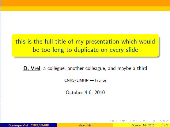
Compiling this file, you will get a first slide like this:
And to give you an idea of what the presentation would look like with my other theme, here is what you'd get:
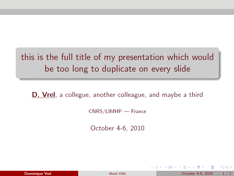
You would have noticed that I actually created here not one, but two slides; the second one would display the table of contents, which would be automatically generated using the \tableofcontents function. Similarly, the first slide would be automatically generated using the information you provided in \title, \author, \institute and \date, by the function \titlepage.
Entering a new slide would be very easy, and would be done through the two commands:
...
\end{frame}
Displaying in wide screen
Nowadays, more and more video projectors are able to display presentations in wide screen. While they are still able to display in the classical 4:3 screen ratio, this is done by discarding pixels on the side of the image, so I think it should be avoided.
The way of doing this is actually quite simple, and goes by the use of the `beamerposter' package. As the name of the package clearly says, this is supposed to be used for beamer to help prepare a poster, so you have to tell the package quite a few things, and so this is what you could write:
sections and subsections
The main reason for writing sections and subsections would be to provide data for the function \tableofcontents; however, there is more to it, namely what was the 'smoothbars' outertheme before, which provides small bullets on top of each slide, each bullet representing a different slide. Section names will be fully writen on top of each slide, and bullets representing slides of the same subsection will be grouped during the slideshow: the active slide bullet will be filled, the bullets representing the slides of the same subsection will be in bold.
Let's try something like that, after the same initial declarations:
\begin{frame}
\titlepage
\end{frame}
\begin{frame}
\frametitle{Contents}
\tableofcontents
\end{frame}
\section{introduction}
\subsection{}
\begin{frame}
\frametitle{Introduction}
this is my introduction
\end{frame}
\section{discussion}
\subsection{first part}
\begin{frame}
\frametitle{Slide 1.1}
slide 1
\end{frame}
\begin{frame}
\frametitle{Slide 1.2}
Slide 2
\end{frame}
\subsection{second part}
\begin{frame}
\frametitle{Slide 2.1}
Slide 3
\end{frame}
\section{conclusion}
\subsection{}
\begin{frame}
\frametitle{Conclusions}
... and these are my conclusions
\end{frame}
\end{document}

Adding a logo
To add a logo was quite tricky to me , it took me some time to figure it all out. Technically, what you will do is to put at a constant absolute position the same image on each slide. To do that, you need a package that will allow you to reach this position. So before the \begin{document} command, you will need to insert the line:
followed immediately by a command to sort of provide a scale by the following lines:
\setlength{\TPVertModule}{1mm}
Then, still before the \begin{document} command, you'll need to declare a new command, such as this one:
\begin{textblock}{15}(121.5,9)
\includegraphics[width=0.6cm]{logo.png}
\end{textblock}
}
Unfortunately, I couldn't find a simple way to force the logo on each slide automatically. You will have to declare each slide by adding the \MyLogo command:
\MyLogo
\frametitle{...}
...
\end{frame}
and so, this is what I would get, providing my own 'logo.png' file, e.g. for the same previous contents slide:
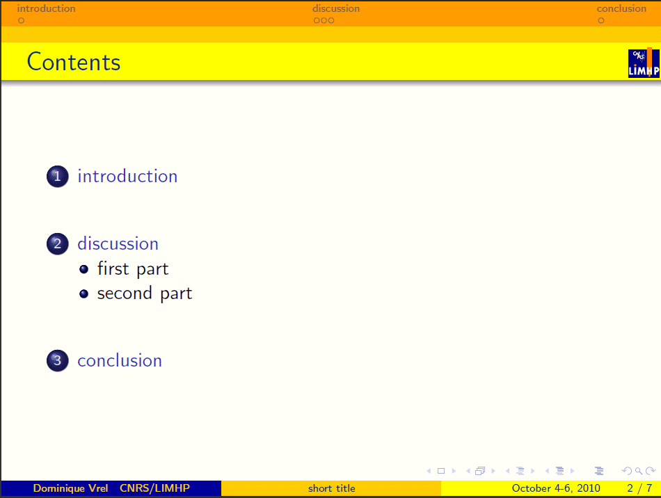
By now, you do understand why the blue-and-yellow color theme makes sense: these are the colors of my lab's logo...
adding a clock
There are several ways of putting a clock, including redefining the logo and allowing a javascript function in it; it's not very difficult to do, but does consume a lot of computer resources for some reason. So instead, I redesigned the 'date' field, as follow.
First you need to introduce before the \begin{document} the tdclock package:
where timeinterval is actually the time waited before refreshing the clock. With 60, you will get the exact time in minutes.
On the first slide, you will need to initiate the clock. So the first slide would be declared as follow:
\initclock
\titlepage
\end{frame}
Here comes the trick: I don't think I need the date on every slide. If I reopen the document months after the presentation, having it on the first slide is enough; and during the real presentation, everybody knows the date. So I change the way the \date command is working by writing, between the first and the second slide:
and so, you will now have on each slide the time, followed but the time you have actually spent on your presentation; so if the chairman has let the previous speaker take too much time, he won't be able to blame you...

blocks
Blocks are just great to emphasize some text. Their declaration is pretty straightforward, so here is the same text written three times, once normally, next in a title-free block, and then in a full block
\MyLogo
\frametitle{Blocks}
this is my text
\begin{block}{}
this is my text
\end{block}
\begin{block}{Please note :}
this is my text
\end{block}
\end{frame}
Note that if you don't want a title, you have to provide an empty title; otherwise, Beamer will consider the first letter of your block as the title, and it will be ugly. Here is what you get:

Blocks exist as "block", "exampleblock" and "alertblock"; there are no differences between them without title due to my personal choices when I designed my themes, but a strong difference when you consider the blocks with the titles:
\begin{frame}
\MyLogo
\frametitle{Blocks}
\begin{block}{normal block}
this is my text
\end{block}
\begin{exampleblock}{example block}
this is my text
\end{exampleblock}
\begin{alertblock}{alert block}
this is my text
\end{alertblock}
\end{frame}

multi-colums
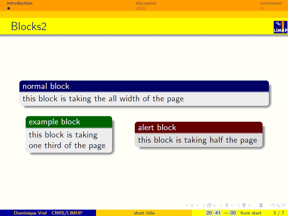
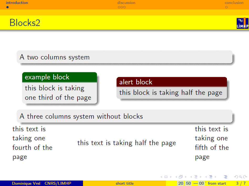
Multicolumning can be performed quite easily using the \begin{columns}...\end{columns} instructions; within this set of instruction, each column may be declared by something like \column{.5\textwidth}. I do recommand using the \textwidth command, so you know very easily how wide it will appear on your screen; also, I do encourage you to make sure that the sum of the widht of your columns is smaller than 1, so they won't touch each other or overlap. Both are pretty ugly... But you can also write something before or after the columns; you even may have a multiple system, such as:\MyLogo
\frametitle{Blocks2}
\begin{block}{normal block}
this block is taking the all width of the page
\end{block}
\begin{columns}
\column{.33\textwidth}
\begin{exampleblock}{example block}
this block is taking one third of the page
\end{exampleblock}
\column{.50\textwidth}
\begin{alertblock}{alert block}
this block is taking half the page
\end{alertblock}
\end{columns}
\end{frame}
\MyLogo
\frametitle{Blocks2}
\begin{block}{}
A two columns system
\end{block}
\begin{columns}
\column{.33\textwidth}
\begin{exampleblock}{example block}
this block is taking one third of the page
\end{exampleblock}
\column{.50\textwidth}
\begin{alertblock}{alert block}
this block is taking half the page
\end{alertblock}
\end{columns}
\begin{block}{}
A three columns system without blocks
\end{block}
\begin{columns}
\column{.25\textwidth}
this text is taking one fourth of the page
\column{.50\textwidth}
this text is taking half the page
\column{.20\textwidth}
this text is taking one fifth of the page
\end{columns}
\end{frame}
inserting images
Inserting images is pretty straightforward: you just need to use the \includegraphics command. But unfortunately, depending on the way you compile your text, it may or may not work depending on the file format of your image. With one system it may be EPS files, for the other PNG files. I didn't figure out why, I think it's a difference between latex and pdflatex compilers... not quite sure.
Anyway, here is the code
\MyLogo
\frametitle{Images}
\includegraphics[scale=0.2]{SHS.png}
\end{frame}

You have to pay attention to the scale you want your image to be displayed; sometimes an image you think to be small will appear to be huge, and may overlap the rest of your slides.
You may also want to put your image somewhere else than where it actually is. My advice : either use a multicolumn environment, as described above, or just center the image using:
\MyLogo
\frametitle{Images}
\begin{center}
\includegraphics[scale=0.2]{SHS.png}
\end{center}
\end{frame}
displaying progressively
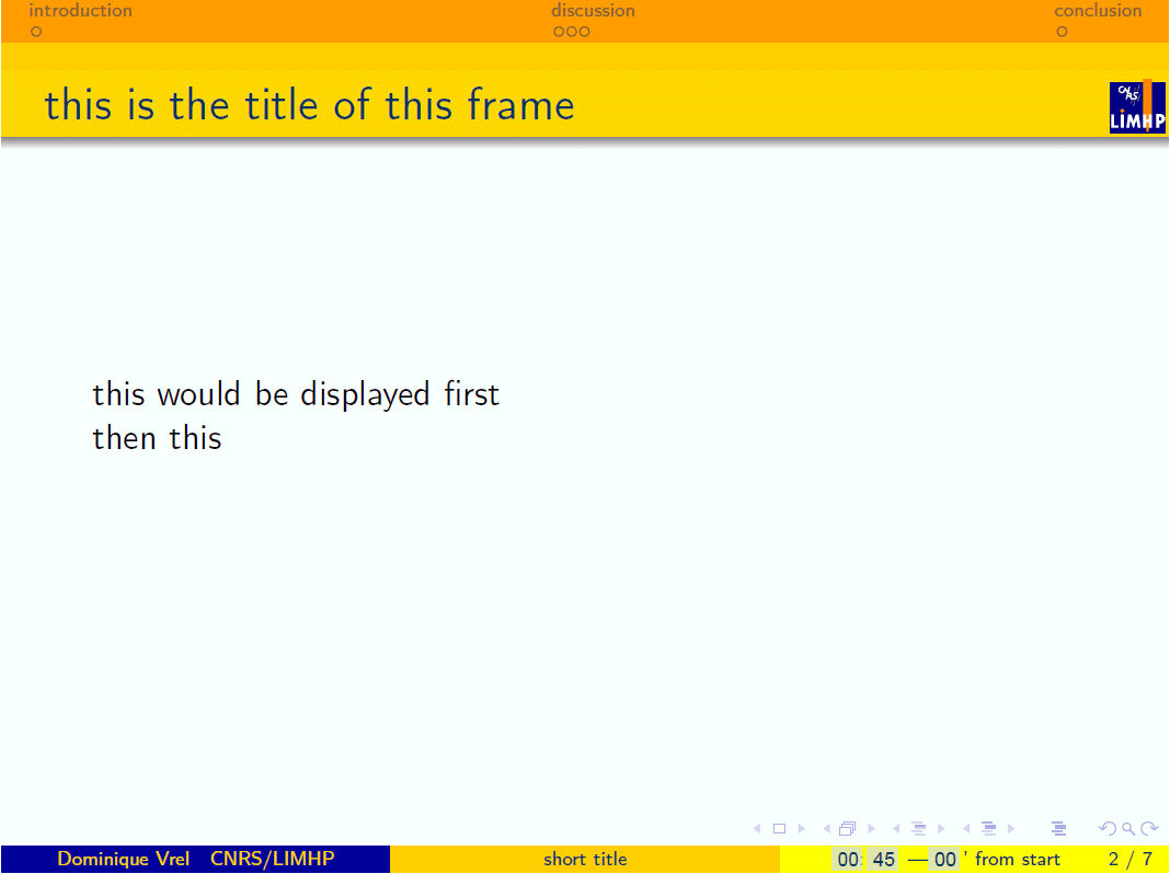
There are two different ways to display, on the same slide, things progressively. The first one uses the \only command, and between <> you would put the pages on which the text will appear: \only<1> if it is only on the first, \only<1-2> for the two first, \only<1,3> for the first anf the third,...\MyLogo
\frametitle{this is the title of this frame}
\only<1> {this would be displayed first\\}
\only<2> {then this\\}
\only<3> {and finally that\\}
\only<1-2> {this is either the first or the second\\}
\only<1,3> {this is either the first or the third\\}
\end{frame}
... will display successively the three slides hereunder:


What is very important is that if your displaying the second 'display' of your slide, what does not belong to it does not exist. On the contrary, using the \invisible command, the text not displayed does exist, but is invisible, so the general display of the slide does not change, since everything is there, even if you may not be able to see it.
\MyLogo
\frametitle{this is the title of this frame}
this would be displayed first\\
\invisible<1,3> {then this\\}
\invisible<1,2> {and finally that\\}
\end{frame}
... will display successively the three slides hereunder:

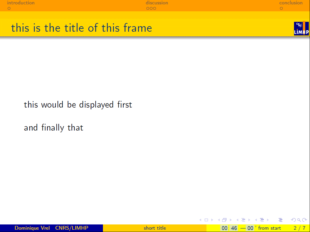
You will have noticed that there is a white line on the third slide; this is because the second line, even though it is invisible, is still there.
Note that technically, it is always the same slide on the three view, and so, if yoy look carefully at the slide number (bottom right), it will not change until you reach the \end{frame} command
Now, technically, both are very versatile: you may use \invisible or \only in a block, or you may use a block or an \includeimage inside an \invisible or an \only. So for example you may, e.g. in your conclusion slide display progressively three blocks:
\MyLogo
\frametitle{Perspectives}
\begin{block}{1st conclusion}
this is the first point I want to emphasize
\end{block}
\invisible<1>{
\begin{block}{2nd conclusion}
this is the second point I want to emphasize
\end{block}
}
\invisible<1-2>{
\begin{block}{3rd conclusion}
this is the third point I want to emphasize
\end{block}
}
\pause
\pause
\end{frame}
Here, note that I put \pause twice, because the blocks will be displayed in three time; this command is just there to tell beamer that despite the fact that I am going to click, it is not supposed to go to the next slide yet. I also coud displayed the third block before the second, just by putting \invisible<1-2> in front of the second, and \invisible<1> in front of the third.
Within the same block, you may also display your text progressively:
\MyLogo
\frametitle{Perspectives}
\begin{block}{1st conclusion}
this is \invisible<1>{the first point} \invisible<1,2>{I want to emphasize}
\end{block}
\pause
\pause
\end{frame}